If you have ever designed a flyer, business card, brochure or poster on a computer, only to find the printed version looks slightly different, you are not alone. One of the most common reasons this happens is the difference between RGB and CMYK colour.
On screen, colours can look vibrant. In print, those same colours may appear softer, darker or less intense. This does not usually mean anything has gone wrong with the printing process. More often, it comes down to how colour is created on digital screens compared with how colour is produced on paper.
Understanding the difference between CMYK and RGB can help you prepare better artwork, set realistic expectations and achieve more consistent print results.
What is RGB?
RGB stands for red, green and blue. It is the colour model used by digital screens, including computer monitors, tablets, phones, cameras and televisions.
RGB is an additive colour model. This means colours are created by adding light together. When red, green and blue light are combined at full strength, they create white. When no light is used, the result is black.
Because screens produce colour using light, RGB can display very bright and vivid colours. Neon shades, intense blues, glowing greens and vibrant reds often look especially strong in RGB. This is why a design may look eye-catching on your screen but slightly different once printed.
RGB is ideal for anything that will stay digital, such as websites, social media graphics, online adverts and email banners. However, it is not the best colour format for most printed materials.
What is CMYK?
CMYK stands for cyan, magenta, yellow and key, with key usually meaning black. This is the colour model used for most professional printing.
Unlike RGB, CMYK is a subtractive colour model. Instead of creating colour with light, it creates colour by applying ink to a surface such as paper, card, vinyl or board. As more ink is added, the colour becomes darker.
In print, cyan, magenta, yellow and black inks are layered in different amounts to create a wide range of colours. This process is used for many everyday print products, including leaflets, brochures, posters, folders, stationery and marketing materials.
Because CMYK uses physical ink rather than light, it cannot reproduce every colour you can see on a screen. Some RGB colours sit outside the printable CMYK colour range.
Why do colours look different when printed?
The main reason printed colours look different from screen colours is that screens and printers create colour in completely different ways.
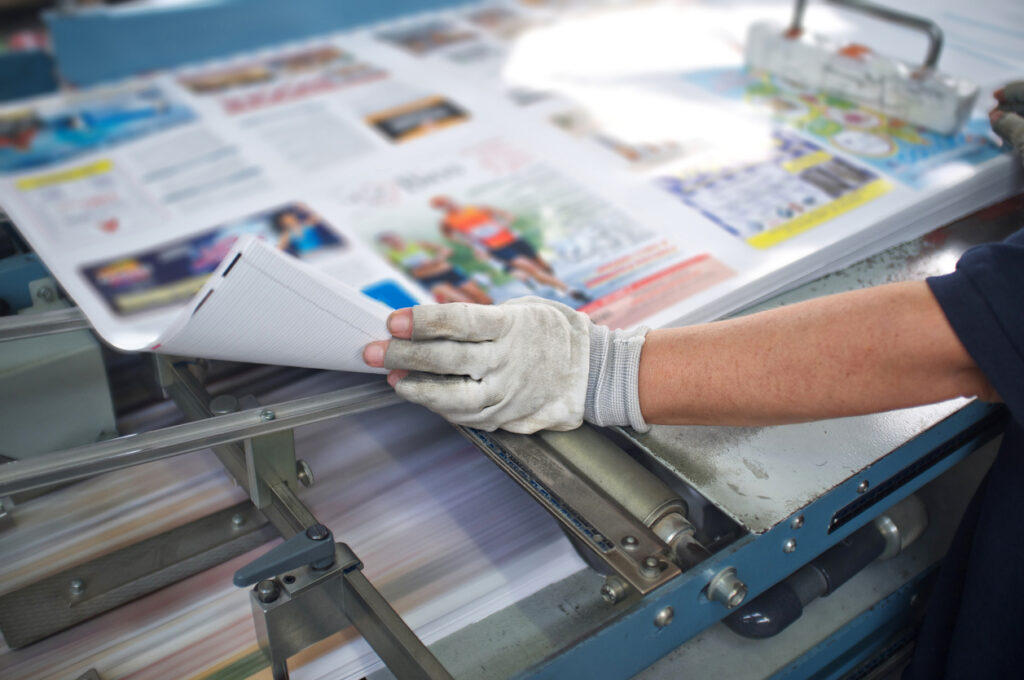
A screen is backlit. It shines colour directly into your eyes using light. Paper does not create light. It reflects the light around it. This means printed colour is affected by the paper stock, ink coverage, finish, lighting conditions and even the type of print process used.
This is why working with professional printing services can make such a difference. A good printer can check your artwork, advise on colour settings and help you choose the right materials for the best possible result.
Common reasons printed colours change
Colour changes can happen for several reasons. The first is file setup. If artwork is created in RGB and then printed in CMYK, some colours may shift during conversion. This is especially common with very bright or fluorescent-looking colours.
Another reason is screen calibration. Not every screen shows colour accurately. A design may look warm and bright on one monitor but cooler or darker on another. Phone screens often increase contrast and saturation automatically, making colours look more intense than they will appear in print.
Paper choice also matters. The same design printed on uncoated paper can look softer than it would on gloss or silk stock. Uncoated paper absorbs more ink, which can reduce sharpness and vibrancy. Coated papers keep more ink on the surface, often creating a crisper and brighter finish.
This is especially important for business stationery, where consistency across letterheads, compliment slips, folders and business cards helps create a polished and reliable impression.
Should you design in CMYK or RGB?
For printed artwork, it is usually best to design in CMYK from the start. This gives you a more realistic idea of how your colours will behave when printed.
If you create your design in RGB, it can still be converted to CMYK before print. However, you may notice some changes, especially if your design uses very bright shades. By designing in CMYK early, you can avoid surprises later in the process.
That said, there are times when RGB files are unavoidable. Many logos, images and graphics are supplied in RGB because they were originally created for web use. In these cases, it is worth checking the converted CMYK version carefully before approving the final print file.

How to reduce colour differences before printing
There are several ways to reduce the gap between what you see on screen and what arrives in print.
First, supply artwork in the correct colour mode where possible. CMYK is usually preferred for printed materials. If you are unsure, ask your printer before sending the final file.
Second, use high-quality images. Low-resolution images can look acceptable on screen but appear blurry or pixelated once printed. For most print jobs, images should be high resolution and suitable for the final printed size.
Third, avoid relying only on your screen. A screen preview is helpful, but it is not a perfect representation of print. If colour accuracy is important, you may want to request a printed proof before the full run goes ahead.
This is useful across everything from flyers and posters to promotional print, where colour consistency helps people recognise your business quickly.
What about Pantone colours?
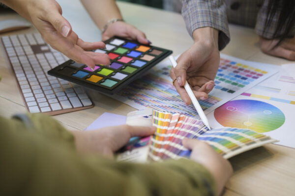
Pantone colours, also known as spot colours, are sometimes used when a very specific colour needs to be matched. Instead of mixing cyan, magenta, yellow and black, a Pantone colour uses a pre-mixed ink formula.
This can be useful for brands that need precise colour consistency across different materials and print runs. However, Pantone printing is not always needed for everyday print jobs. CMYK is often the most practical and cost-effective option for leaflets, brochures, menus, posters and general marketing materials.
Your printer can advise whether CMYK or Pantone is the better choice depending on your artwork, budget, quantity and required finish.
Does the material affect colour?
Yes. The material you print on can have a big impact on colour.
A design printed on white gloss paper will not look exactly the same on recycled stock, textured card, vinyl, fabric or display board. Each surface absorbs and reflects ink differently.
This matters for large format displays, event materials and exhibition print, where your graphics may need to be seen from a distance, under bright lights or alongside other branded materials. In these cases, choosing the right material is just as important as setting up the artwork correctly.
Avoiding Colour Surprises in Your Printed Materials
CMYK and RGB are both important, but they are designed for different uses. RGB is best for screens, while CMYK is best for print. Bright RGB colours often need to be converted into the closest achievable CMYK match, which can lead to small changes in tone, brightness or vibrancy.
By preparing artwork correctly, choosing the right paper or material, checking colour settings and working with an experienced print team, you can avoid common issues and achieve a more reliable final result.
Before sending your next design to print, take a moment to check whether your artwork is set up in the right colour mode. It is a small step that can make a big difference to the quality of your finished print.

